ShopDreamUp AI ArtDreamUp
Deviation Actions


Suggested Deviants


Suggested Collections


You Might Like…


Featured in Groups


Description
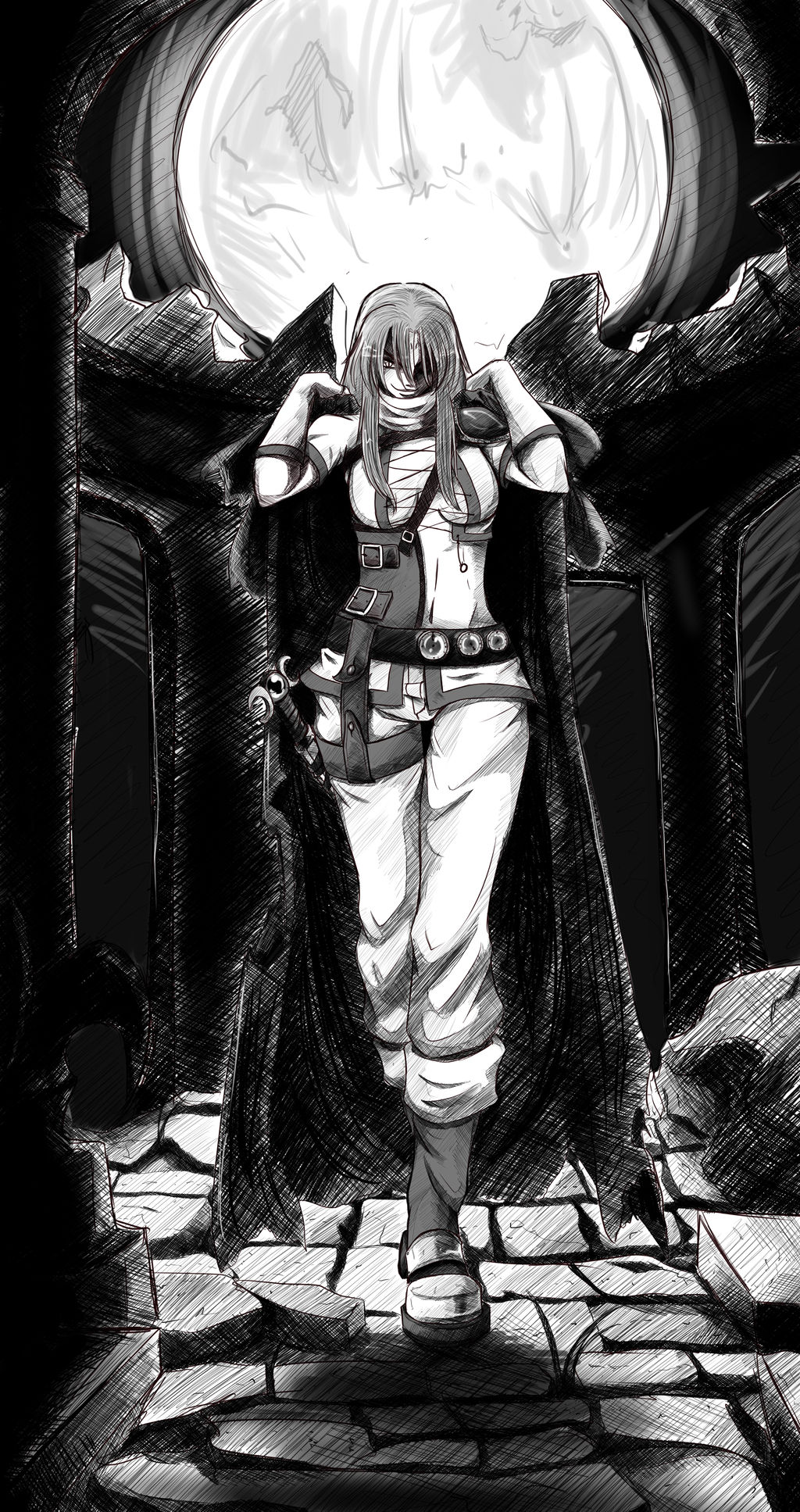
Well...this is the moment of truth. The one where I have applied everything I have learned.
The ultimate sketch. The result of studying..the result of practice...the two day journey into crosshatching and...you get the point.
I...well...I don't know what to say really. I'm satisfied with this piece all around.
Someday, when I'm better at coloring, I hope to color it.
Since I'm working on Slayers I wanted to post a mood piece for Luna. It's a nod and a compliment to the following (which I studied for about 2 days before starting this piece)
Pu-sama's "Trickster-sketch"
Feel free to pick it apart, I feel like I still need to work on some details ...like her pants. I wasn't completely happy with the pants but that's probably because I am waiting for her new color palette so I wasn't confident in the values but...I think I got it.
And this whole night scene thing gets me every time. I know it's stylized light but...maybe it should be darker? but I was worried you wouldn't be able to see her so...I don't know.
-----------------
Edit one
I woke up this morning to about 140+ messages ALL FAVS and watches!
I'm excited, it really speaks loads about the speed of my improvement and I would like to thank you all from the bottom my beating heart for the favs and watches and..hell if you LOOK at the piece I'll love you forever. It's motivating and...this makes me want to push harder! MORE!!! MOOOOOOOOOOOAR!!!!!
-----------------------
Edit 2
Well...I *hope* I fixed it the way *pu-sama described...I hope. The cloak is still a mess and the rubble behind. Maybe it calls for more detail since it's farther way but the way I wanted it was the temple used to be a sort of dome (like the Pantheon) so my instinct was that you wouldn't see the details of the wall/arches behind her but then I thought of the windows and was all like "whuuut?" so...*maybe there'll be another edit once I get that question answered. Maybe. We'll see. I don't like to keep revisiting artwork rather I'll show my improvement in another piece but..who knows. I need to get my brain thinking about these things or else I'll stagnate.
Image size
2700x5100px 15.48 MB
© 2011 - 2024 djwagLmuffin
Comments69
Join the community to add your comment. Already a deviant? Log In
This came out really nice, it's clear a lot of effort was put into it too. I can see a clear difference from your other works for certain and Luna's got a nice frame around her main body that lets her torso and legs read really well, but she's lacking this frame for her head and its getting lost in the background behind it (they're very close to the same shade. usually you want to frame light against dark and dark against light UNLESS you want a certain piece to fall into nothingness, then you can allow them to merge... but for the head I don't think you would want that in this particular piece? My suggestion would be to get rid of the "rubble" line on top of the pillars and let her read cleanly against the moon since her hair is dark). Another thing I can point is to not let your marks become too unanimous. If you croshatch the background in a certain style, you need to crosshatch the cape in a different pattern r it will become one and read as a solid mass . Just try different crossshatching patterns or do contour shading (shade in the direction your cloth is falling, for example). Also remember that your foreground elements need to be much darker, so the pillars in front of her, if used as a design element, in this case would read better with a much higher contrast and a very slender backlighting. (this piece in general would be backlit due to your light source if we go by the moon) and finally I'd just say watch your proportions. Unless you're doing a realism piece, distortions usually need to (and will) say a lot about your character subconsciously. Her head seems very small on her body and this can go both ways... a character with a thick body and a small head can be read as powerful but it can also read as "unintelligent" or "clumsy", so in this case I'd say either make her head a little larger (which can be easily done wiht some free transform tricks - love photoshop!) or build her hair up to create the stronger illusion that her head is at a down-tilted angle (both are easy things to do really quick in photoshop). You'll notice Araizumi Rui actually implements big against small a lot in his works, this is usually a good design element to break the body up to have a nice flow. Now, with that said, I'll also add that the pose has a lot of good attitude in it. It reads naturally and says a lot about her. Also, oddly enough, I like the broken stone floor a lot. Anyway, sorry for writing so much... you asked for a crit and I"m procrastinating so I decided to give one D: